
AI in Graphic Design: Everything Works Until the Second Revision
August 17, 2026 · 10 min read
Ask ten designers about AI in graphic design and you get ten versions of the same answer: it is a tool, it speeds things up, creativity still matters. All true. All useless the moment you actually have to ship something.
Here is the test that separates the marketing from the reality. Generate a poster you are happy with. Now the client comes back with the most ordinary request in the industry: make the price 49 instead of 39, swap the headline, and give me a story version for Instagram.
That request — mundane, universal, and a fair description of most real design work — is where the majority of AI design output quietly dies. Not because the image was bad. Because it was an image.
This guide covers what AI genuinely does well in design today, the specific thing it still cannot do, and how to tell within thirty seconds whether a tool has handed you something you can actually work with.
What AI in graphic design is genuinely good at right now
Let us give credit where it is due, because the sceptics overcorrect just as badly as the evangelists. There is a real list of things AI does better than a human with a deadline:
- Divergence. Twenty directions in four minutes. Not twenty good directions — but enough range that you stop circling the first idea you had in the shower.
- Mood and reference. Describing a look you cannot name ("editorial, but warm, like a 1970s travel guide") and getting something to point at is a genuine unlock in client conversations.
- The tedious middle. Background removal, masking, upscaling, object removal, generative fill. This is mature, reliable, and has quietly saved the industry thousands of hours — it is also the part Adobe leads with when it pitches Firefly to designers.
- Copy variants. Fifteen headline options at three different lengths, so the layout can be tested against real text instead of dummy filler.
- Getting off zero. A blank canvas is expensive. A mediocre first draft you can argue with is cheap.
Ask working designers what they actually use it for and the answers converge on the same territory: briefs, mood boards and key-visual exploration rather than finished artwork. A 2026 Clutch survey found 88% of businesses now use AI design tools while 90% still hire graphic designers — roughly what you would expect if these tools were handling the middle of the job rather than the end of it.
Notice what every item on that list has in common: they all happen before the design is finished. AI is at its strongest during exploration and at its weakest during delivery — and almost every article about AI in graphic design blurs the two together.
Where AI in graphic design breaks: you got a picture, not a file
A generated design is a grid of pixels. That sounds obvious until you list what it costs you.
The text is not text. It is a drawing of text. The letterforms are whatever the model approximated, the kerning is whatever fell out, and changing a single character means regenerating the entire composition and hoping the rest survives. It usually does not.
Your brand colour is approximately your brand colour. Compression, generation noise and colour profile drift mean your #E8442F comes back as something in the neighbourhood. On a screen at small size, nobody notices. Next to the actual brand asset, everybody does.
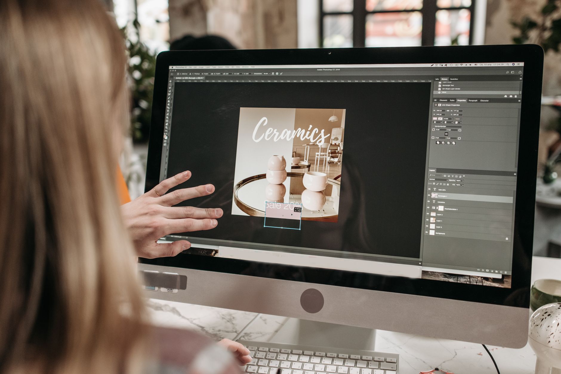
There is no structure to edit. No layers, no groups, no type objects, no spacing rules. The background and the headline and the logo are the same undifferentiated surface. You cannot move one without repainting the others.
It does not hand off. A printer wants bleed, CMYK and 300 DPI. A developer wants the type spec. A colleague wants to open it in the tool they already have. "Here is a PNG" answers none of those.
So the useful question is not whether AI will replace graphic designers. It is far more practical: does what this tool gave me survive contact with a revision?
The second-revision test: five questions for any AI design tool

Run these five questions against anything that calls itself an AI design generator — whether that is a generator built into a design platform or a standalone image model. They take about thirty seconds and they are far more revealing than a feature page.
- Can I change one word without regenerating? If editing the price means rolling the dice on the whole composition, you do not have a design. You have a lottery ticket.
- Is the brand colour exact, or close? Ask for a specific hex value and sample the result. Close is not a brand.
- Can I resize without redrawing? A square post, a story, a landscape banner. If each ratio is a fresh generation with a different layout, you cannot run a campaign — you can only run a lucky day.
- Can someone else open it? A layered PSD is the lingua franca of the industry. If the output cannot leave the tool, neither can your work.
- Does the text stay text? This is the same question as the first one, asked technically, and it is the single strongest predictor of whether the tool will still be useful to you in month three.
Most tools pass one or two. The ones that pass all five are doing something structurally different: they are generating a document and then rendering it, rather than generating a picture and calling it a document.
The maths nobody runs: one image versus one file
The picture-versus-file distinction sounds academic until you attach a campaign to it.
Take a modest launch: one offer, four placements (square post, story, landscape ad, email header), two languages, and three rounds of client feedback. That is eight finished assets, each touched three times — twenty-four production events.
If your unit of work is a generated image, every one of those twenty-four events is a regeneration. Each regeneration is a new composition, which means each one needs reviewing again, and roughly a third of them will drift far enough from the approved direction that you generate again. Consistency across the eight assets is not something you maintain — it is something you hope for, and then patch by hand.
If your unit of work is a structured file, the same campaign is one composition, four export sizes, two text sets, and three rounds where a round means editing values. The review burden collapses because nothing changed except what you meant to change. Consistency is not maintained; it is structural.
This is why the file question is not a technical preference. It is the difference between design work that scales with the size of the campaign and design work that scales with the number of revisions — and revisions are the thing you cannot control.
It is also where costs quietly land. Regeneration is cheap per image and expensive per campaign, because the expensive part was never the render. It was the reviewing, the reconciling and the redoing.
AI in graphic design and Arabic: where it fails hardest
If you work in Arabic, you already know the punchline. Generated "Arabic" is usually decorative nonsense: letters that refuse to join, diacritics floating above nothing, words spelled with characters that do not exist in that order. It reads as Arabic to someone who does not read Arabic.
The problem runs deeper than glyph rendering. A genuinely right-to-left layout is not a mirrored left-to-right one. Reading order, visual entry point, the direction a figure faces, where the logo sits, how a number sequence runs inside an otherwise RTL line — these are composition decisions, not a transform. The W3C maintains an entire specification of Arabic script layout requirements for exactly this reason, and models trained overwhelmingly on English-language design output have absorbed none of it.
There is a second-order effect worth naming. Because generated Arabic looks plausible at a glance, it survives internal review in organisations where the decision-makers do not read the language. The error is caught by the audience, publicly, after publication. That is a different class of risk from an ugly layout.
The practical consequence: for Arabic and bilingual work, the generation step is even less able to be your final step. You need a structured file where the type is real text in a real Arabic typeface, shaped and measured correctly, in a layout that was composed right-to-left rather than flipped. We go deeper into this in Arabic design and RTL.
A workflow for AI in graphic design that actually holds up

The workflow that survives real clients separates the two halves cleanly: generate to explore, structure to deliver.
- Brief in words, not adjectives. Audience, message, the one thing that must be read first, the constraint (format, language, where it will be seen). Vague briefs get vague output from humans too.
- Generate for direction, never for delivery. You are shopping for a composition and a mood. Ignore the text in the output entirely — it is filler no matter how convincing it looks.
- Rebuild the winner as a real file. Layers, type as type, your actual hex values, your actual typeface. This is the step people skip, and it is the step that makes everything after it cheap.
- Lock the system, not the artwork. Colours as swatches, type as styles, spacing as rules. Then a revision touches a value, not a canvas.
- Export the set from one source. Every ratio, every language, every placement out of a single file — which also keeps you honest about platform specs like Instagram carousel sizes.
Done this way, the second revision costs ninety seconds instead of a regeneration and an apology. The template library is a reasonable shortcut for step three when you do not want to rebuild structure from scratch.
How to write a design brief an AI can actually use
Most disappointing output is a briefing failure, not a model failure. A prompt built from adjectives — "modern, clean, premium" — describes a feeling, and a feeling has no layout. A brief that produces something usable has five parts:
- The job. What this design has to make someone do. Not "a poster for our sale" but "get a passer-by to notice 40% off from four metres away."
- The hierarchy. Name the first thing that must be read, the second, and the thing that can be small. If you cannot rank them, neither can anything else.
- The constraint. Format, aspect ratio, language, where it appears, whether it will be printed. Constraints are what turn a picture into a design.
- The reference. One or two specifics rather than a genre. "Type set tight and large, like a Swiss concert poster" beats "minimalist."
- The exclusions. What must not appear. Stock-photo handshakes, gradient meshes, fake interface screenshots — whatever your category is tired of.
Then read the output for structure rather than polish. Does the hierarchy hold? Is the entry point where you wanted it? Would this still work with your real headline, which is probably twice as long as the dummy line? Those are answerable questions. "Do I like it" is not, at this stage.
One more habit worth building: keep the brief and the file in the same place. When the description that produced a design lives next to the design itself, the next revision starts from intent rather than from archaeology — which is much of the argument for driving a design tool from a conversation, as the Claude connector setup does.
What to stop asking AI to do
A short list, offered without hedging:
- Stop asking it to render your final copy. Prices, dates, phone numbers, legal lines and names are exactly the content that must be correct and exactly the content generation gets wrong.
- Stop asking it for your logo. A logo needs to be a vector that reproduces identically at 12mm and 12 metres. A generated one is a picture of a logo.
- Stop treating the first good-looking result as finished. Good-looking and shippable are different states, and the gap between them is entirely made of structure.
- Stop asking it to be the last step. Make it the first. That is where it is genuinely excellent, and where none of the failure modes above apply.
None of this is an argument against AI in graphic design. It is an argument for putting it where it works. The tools worth your time are the ones that understand the deliverable is a file — see what the editor does for the version of that argument in software form, or how it plays out by audience.
What this looks like when the AI gives you a file
Frequently asked
- Will AI replace graphic designers?
- Not in its current form, because generation produces images and design work produces files. What AI is replacing is the slow, repetitive middle of the process: masking, resizing, first-draft exploration and copy variants. Designers who move that work to AI and keep control of the structured file get faster. The role changes; it does not vanish.
- What is AI in graphic design actually best used for?
- Exploration. Generating a wide range of directions quickly, building mood boards, describing a visual language you cannot name yet, and handling tedious raster tasks like background removal and upscaling. It is strongest before the design is finalised and weakest at the point of delivery.
- Why does AI get text wrong in generated designs?
- Because it is not typesetting text — it is drawing an approximation of what text looks like. There is no font file, no character, no baseline. That is why the letters look slightly off, why kerning is inconsistent, and why editing a single word requires regenerating the whole image rather than clicking into a text box.
- Can AI produce an editable, layered file instead of a flat image?
- Some tools can, and it is the most important thing to check. A tool that generates a structured document — real layers, real text objects, real colour values — and then renders it can export to PSD and be edited afterwards. A tool that generates pixels cannot, no matter how good the pixels look.
- Is AI design output good enough for Arabic?
- Generated Arabic type is generally not usable: letters fail to join correctly, diacritics land wrong, and words are often not real words. Beyond the glyphs, right-to-left composition is a different set of layout decisions rather than a mirror of a left-to-right one. For Arabic work, treat generation as a mood step only and build the final layout in a tool with native RTL text handling.