
AI infographic generator that draws real charts
Describe what you are explaining and get a sheet where the graphic does the work — bars whose lengths are the data, proportion rows, timelines, step flows — with generated artwork to lead it.

No sign-up to try · No credit card required
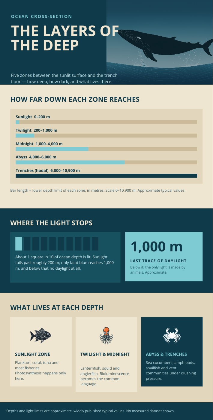
Generated by Lawh.ai — every element is a separate, editable layer.
Charts drawn to true proportions
A bar twice as long means twice the value, bars start at zero, and percentages are drawn against 100 rather than against the largest value on the sheet. Every number is labelled with what it measures and its unit.
It will not invent your figures
Numbers you supply are used exactly as given. Numbers you do not supply are never manufactured to fill a chart — you get a structural infographic instead, and it says so. A fabricated statistic is published by whoever trusts it.
Artwork, not a wall of boxes
Every sheet gets real generated illustration and an icon per section, on a ground that was chosen rather than defaulted to white. The charts stay editable shapes underneath — recolour a bar, retype a label.
Keep your tools. Add the AI.
Lawh.ai is not somewhere your work goes to get stuck. Every design leaves as a file the software you already use can open.

Frequently asked questions
What kinds of charts can it make?+
Column and horizontal bar charts, proportion rows, big-number stat blocks, step flows, timelines and comparison tables. It deliberately will not draw pie or donut charts: the document model has no arcs, and a pie approximated from rectangles is a wrong picture of the data — so the same numbers come back as bars instead.
Will it make up statistics if I do not give any?+
No. Where a brief supplies no figures it builds the sheet from structure — a sequence, a comparison, an anatomy — and states in the footer that no figures are shown. For general subjects it may use well-established public values, marked as approximate rather than presented as something you measured.
Can I edit the chart afterwards?+
Yes. The bars are shapes and the labels are text, all on their own named layers, so you can change a value's colour, retype a figure, or restyle the whole sheet in the browser or in Photoshop.
What size are the infographics?+
A tall 1080 × 1920 by default, since infographics are read by scrolling, with square, wide and extra-long presets available. If the content needs a little more room the sheet grows rather than cropping its last section.